Badass Animal Rescue
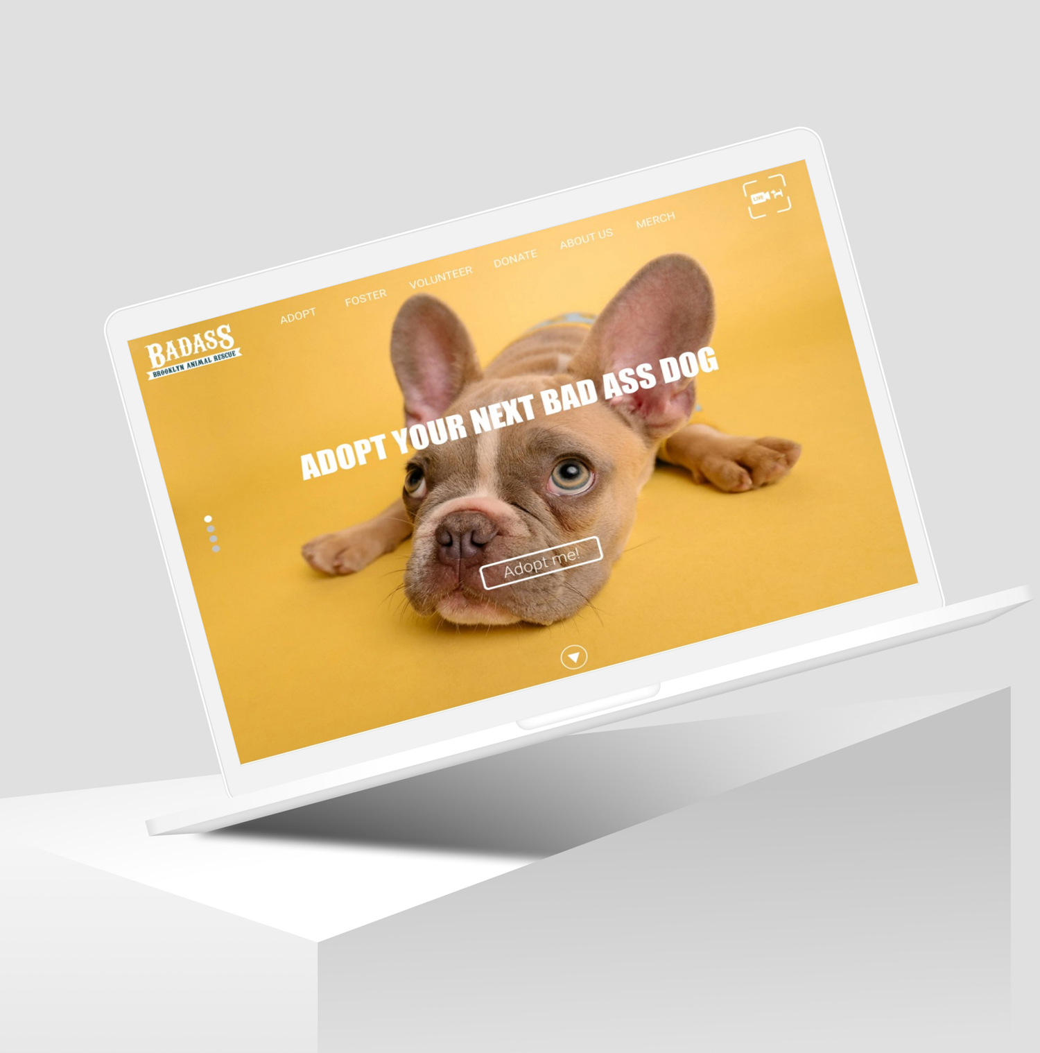
Badass Brooklyn Animal Rescue — Responsive Website Redesign
Overview
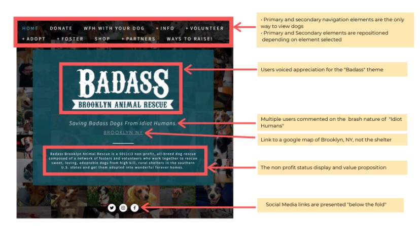
Badass Brooklyn Animal Rescue is a non-profit dedicated to saving and rehoming dogs across the East Coast. After COVID-19, their website no longer supported the needs of adopters, fosters, and volunteers—users struggled to find information, navigate key pages, and complete essential tasks.
Our team was brought on to redesign their responsive website to improve clarity, trust, and usability across desktop and mobile.
01 — Research & Discovery
To understand the current experience, we conducted:
- Heuristic evaluation of the existing site
- User interviews with primary adoption-focused users
- Mid-Fi usability testing to uncover friction points
- Comparative analysis of other rescue and adoption platforms
Our early findings revealed:
- Users wanted simpler pathways to browse dogs.
- Iconography and visual cues lacked clarity.
- Key actions (finding a dog, learning about the adoption process) were buried.
- Mobile viewing created unnecessary friction—text-heavy sections and unclear CTAs slowed users down.
These insights informed our direction for the Hi-Fi redesign.
02 — Usability Testing Method
The High-Fidelity prototype was created in Figma and tested using the exact same:
- Three core tasks
- Script and scenario prompts
- 1–5 rating scales
…as our Mid-Fi testing to allow for accurate comparison.
After testing, we synthesized our insights into three detailed reports focused on:
- What worked
- What did not
- Recommendations for refinement
03 — Hi-Fi Findings
The final round of usability testing revealed strong improvement in navigational clarity and task success, with some ongoing opportunities.
What Worked
- Users found the faceted search clear and intuitive.
- Participants easily discovered adoptable dogs through multiple paths.
- Navigation felt more organized and aligned with user expectations.
What Needed Improvement
- Some attribute icons were still unclear.
- A few users felt overwhelmed by the number of filters.
- Visual design satisfaction slightly decreased—suggesting aesthetic refinement was needed.
Quantitative Results
- Navigation: 6.3% easier than Mid-Fi; 10% easier than the current site.
- Overall satisfaction: 7% lower than Mid-Fi; 2.4% lower than current site due to visual preferences.
04 — Design Improvements
Based on Mid-Fi test results, we refined the adopter user flow and expanded it into three key pages:
Homepage Enhancements
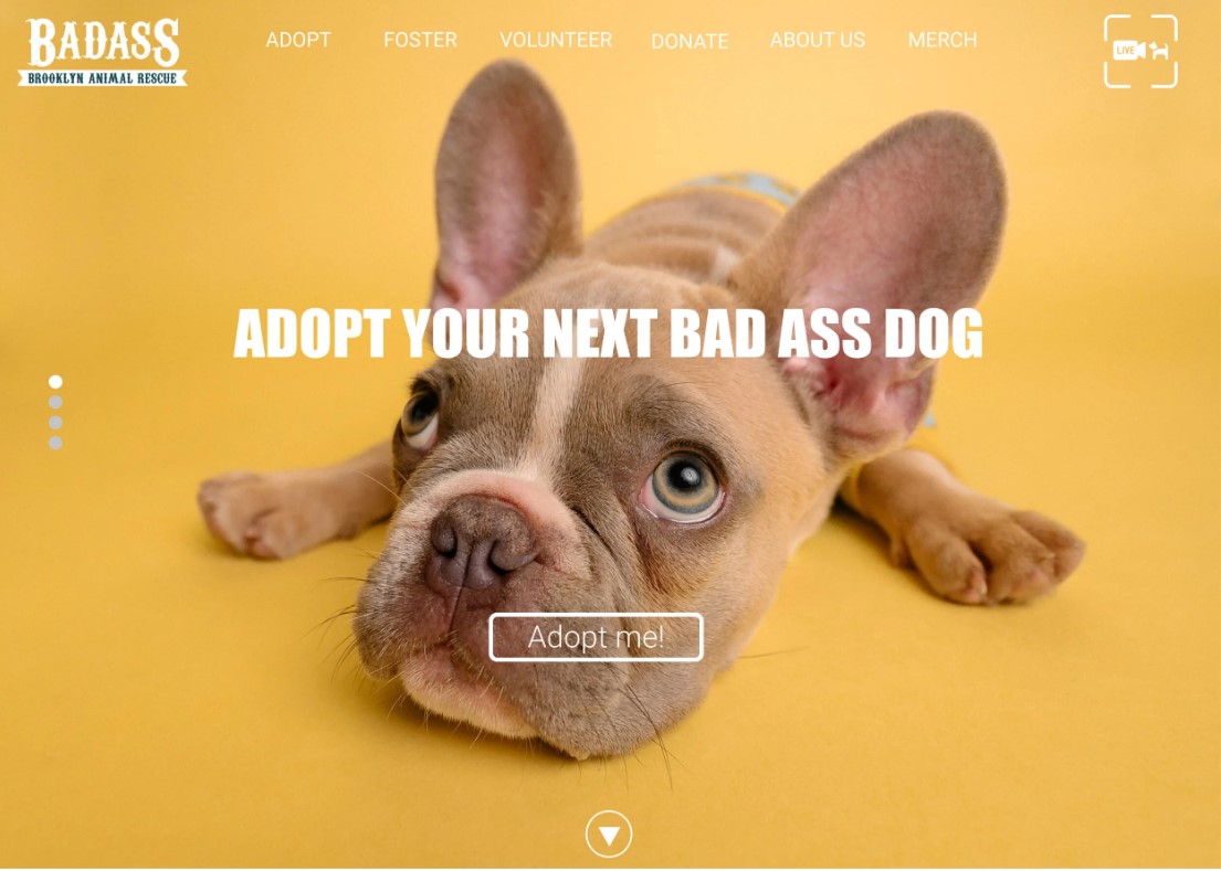
- Full-width carousel hero
- One featured dog card to reduce cognitive load
- Warmer, more inviting language
- Strong, clear CTAs
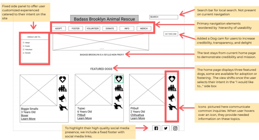
- Removed redundant “I’d like to…” panel
- Moved Contact Info + Dog Cam to footer
Find a Dog — Search & Filter Improvements
- Removed redundant windows
- Added an Icon Legend for clarity
- Swapped icons for simple, line-based visuals
- Transformed “How It Works” into an interactive guide
- Reorganized filters around user priorities
- Modernized dog cards with cleaner hierarchy
Dog Profile — New in Hi-Fi
- Added bullet-point attributes for fast scanning
- Transparent backstory for emotional connection
- Large, shareable images
- Action-driven CTAs (“Apply to Adopt,” “Meet Me,” etc.)
- First-person storytelling tone to highlight each dog’s personality
05 — Responsive Design Strategy
Designing for mobile meant reevaluating hierarchy, interaction, and reading patterns.
We optimized the experience by:
- Prioritizing the most essential content above the fold
- Shortening headlines and text for faster mobile scanning
- Reusing visuals strategically to anchor attention
- Improving CTA touch targets for accessibility
- Designing for vertical reading instead of F/Z patterns
Our goal was to help users reach what they care about most discovering dogs with as few taps as possible.
06 — Lessons & Next Steps
Next Steps
- Refine iconography for clarity
- Reduce filter complexity
- Explore desktop enhancements
- Brainstorm methods to increase brand personality and emotional stickiness
- Test visual design variations to raise satisfaction scores
What This Project Taught Me
This project reinforced the importance of:
- Designing with empathy for emotionally driven decisions like adoption
- Balancing clear information architecture with warmth and trust
- Creating responsive systems that adapt, not shrink
- Testing early and often, even small insights change the experience
