Skillet
Summary
UX/UI and Native iOS App Design
Project Timeline: 17 Days
UX Methods Used:
User Interviews, Competitive and Comparative Analysis, Affinity Mapping, Journey Map, User Flow, Design Studio, Mid-Fi Wireframe, Hi-Fi Prototype (Figma)
Tools: Figma, Miro Pen & Paper, Photoshop
About Skillet
Skillet is a cooking-skill app that guides users through curated lessons to improve technique and stay safe in the kitchen. With personalized goals and smart technology, it encourages people to learn, experiment, and discover joy in cooking.
Discovery
Starting this project came with a few early challenges. Our goal was to create something genuinely useful. An experience that people at any skill level could rely on. To focus our direction, we launched a screener survey and began planning interviews with a diverse group of users, from complete beginners to confident home cooks.
You might be wondering, “In such a saturated cooking space, where is the real opportunity?” Through our research, we found that busy professionals struggle to learn new techniques because they don’t have time to sift through endless online tutorials and conflicting information. This revealed a clear gap. A personalized, educational tool that guides people through cooking with structure, clarity, and efficiency.
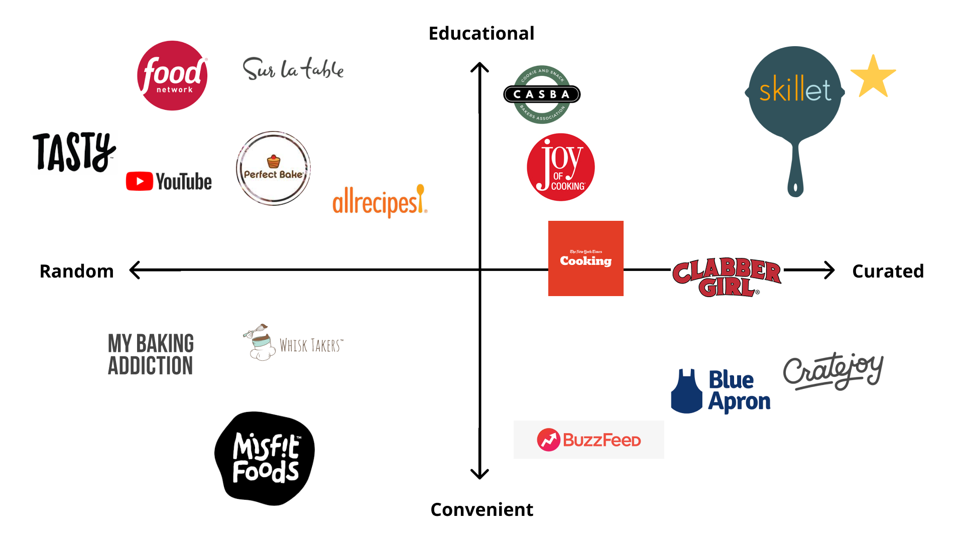
Once we completed a competitive matrix, an even bigger insight emerged, there’s a significant opportunity in educational baking. But that raised more questions, Why are there so few tools dedicated to learning how to bake? Why is the market saturated with general cooking content but lacking structured baking education? And with baking more popular than ever among home cooks, why hasn’t this need been addressed?
These questions ultimately shaped the direction of our solution.
Define
The team began the project with a deep dive into research, identifying both direct and indirect competitors and analyzing what each offered. After interviewing 15 users, we uncovered an important insight: while many participants rarely baked or had never attempted it, but consistently expressed interest in cooking and improving their techniques.
Using affinity mapping, we looked for patterns across our interviews. A clear trend emerged, baking wasn’t a universal priority. Users were far more motivated by learning practical cooking skills they could apply daily. Based on this, we aligned as a team and shifted our focus from educational baking to educational cooking.
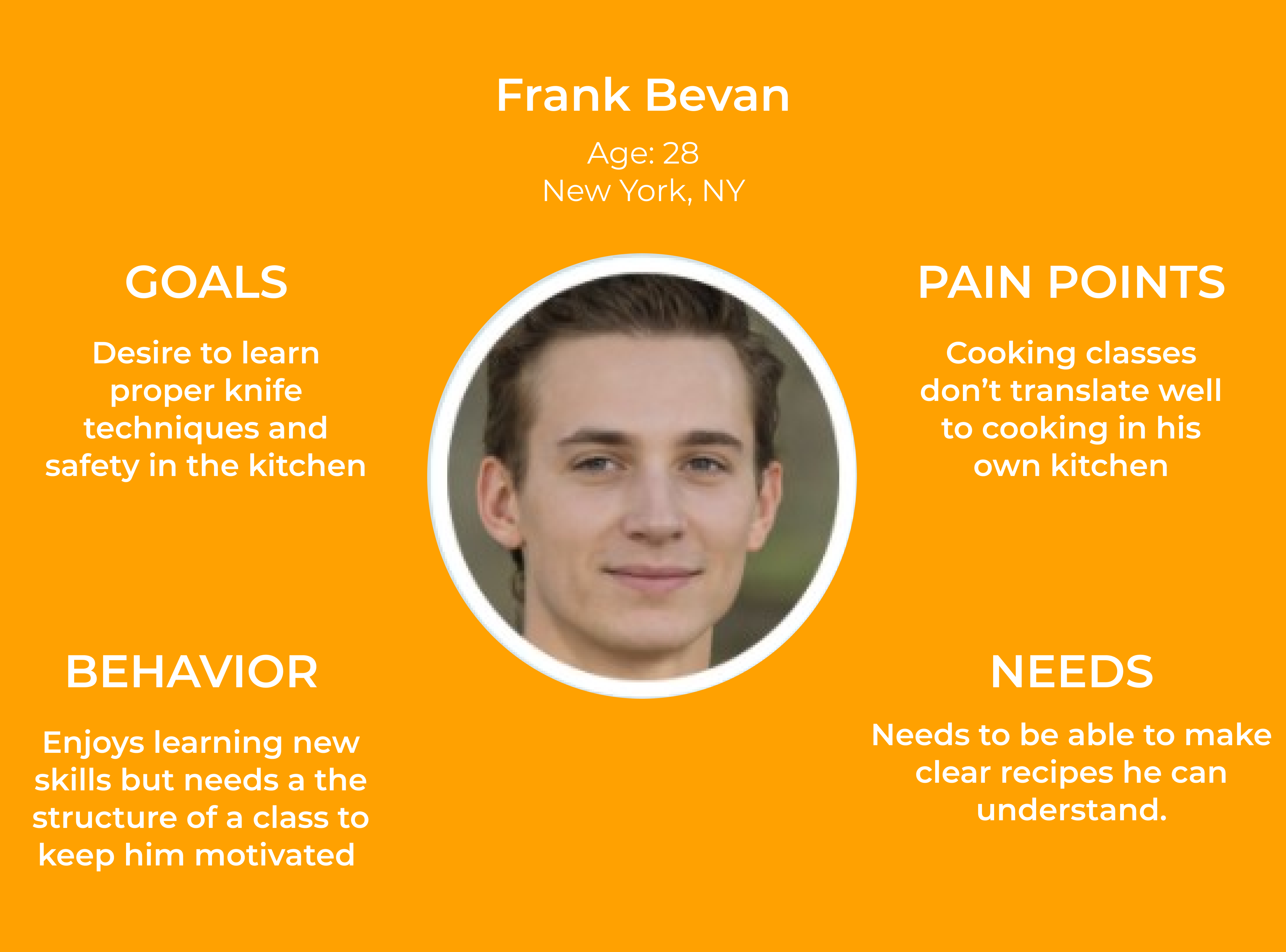
As we synthesized our research, more recurring themes began to surface. This led us to create our persona, Frank a representation of the users we aimed to serve. With Frank as our guide, we crafted the problem statement that would shape the rest of our process:
How might we provide a clear path for Frank to improve his cooking technique while exploring new dishes from the comfort of his own home?
Design
With our persona Frank and our problem statement defined, we moved into the design phase. Guided by the question “How might we help Frank improve his cooking technique while learning new dishes from home?”, we kicked off a two-round Design Studio. In each round, we sketched low-fidelity concepts, presented our ideas, gathered critique, iterated on the strongest solutions, and then collaborated to establish a unified direction.
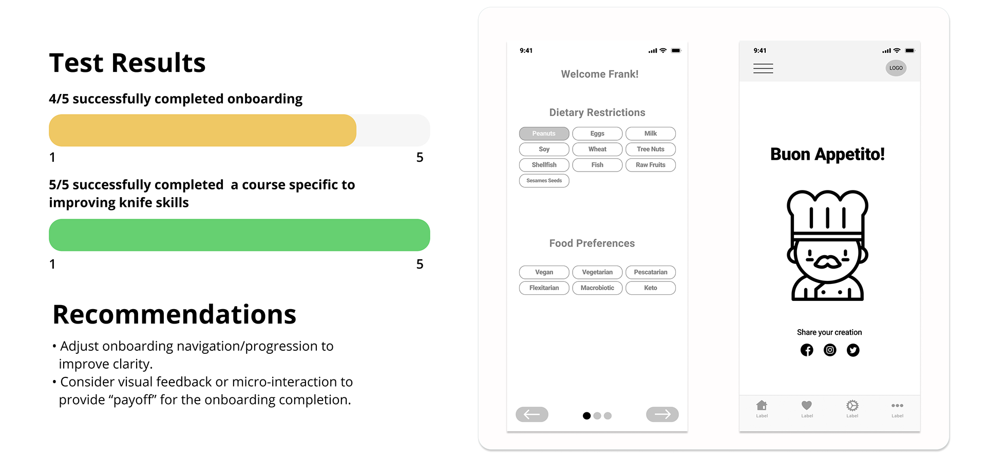
Following the Design Studio, we translated our selected ideas into mid-fidelity wireframes. Working at this level allowed us to refine layout, structure, and user flow without the constraints of high-fidelity detail. Once the prototype was ready, we conducted usability testing with five participants, asking them to complete two tasks based on the following scenario:
Scenario:
You’ve recently started cooking more at home after New York City indoor dining closed. Saving money has been a bonus, and cooking is becoming a hobby, so you download an app to build your skills.
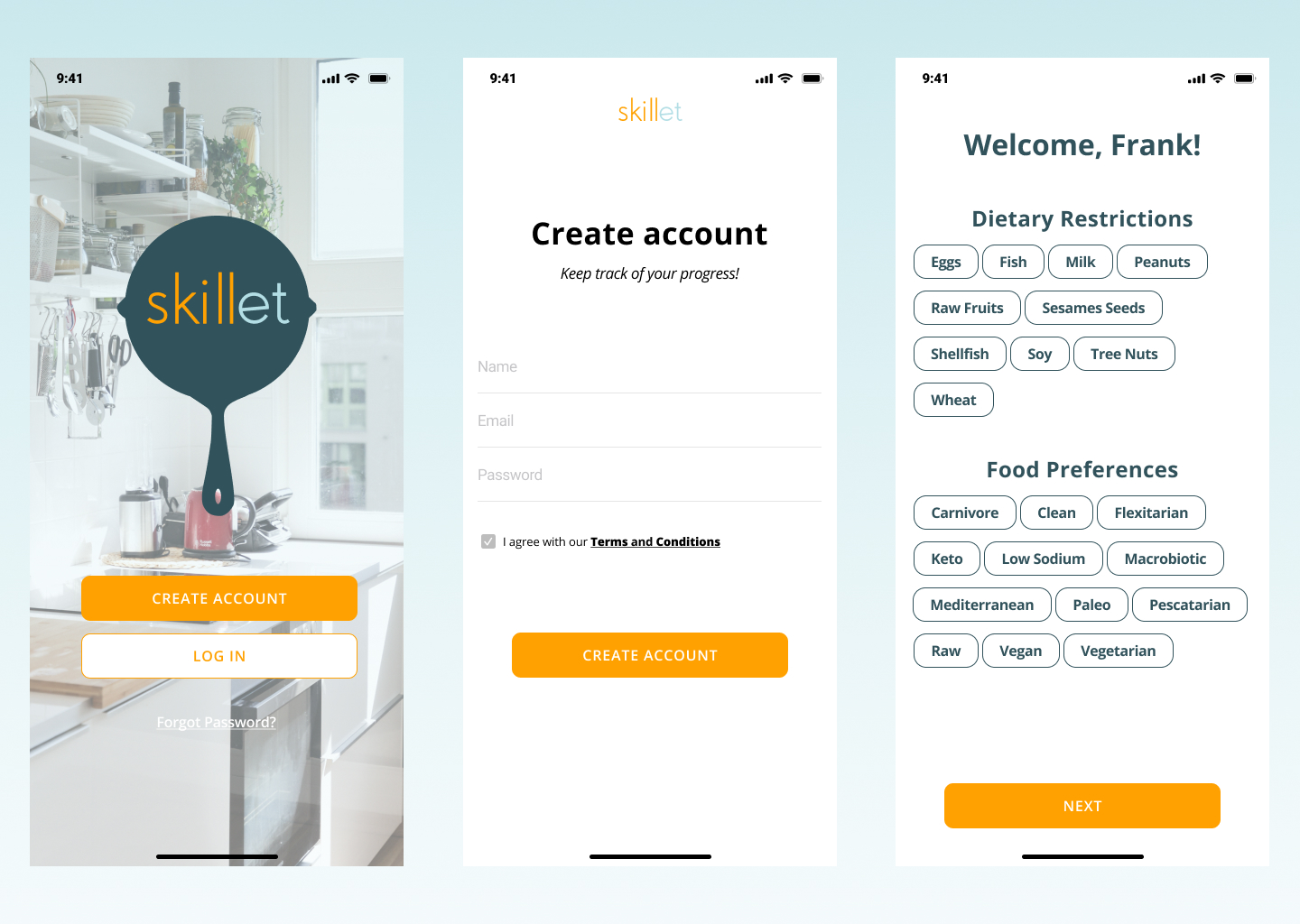
Task 1
Goal: Sign up for a “Cooking Course.”
Prompt: How might you enroll and complete the onboarding quiz to specify your peanut allergy and the tools you already own?
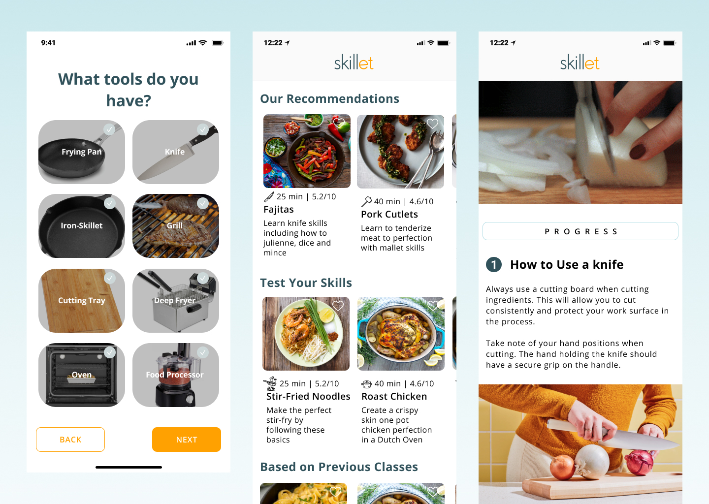
Task 2
Goal: Find and complete a course to improve knife skills.
Prompt: How might you locate a class focused on techniques like different cutting methods?
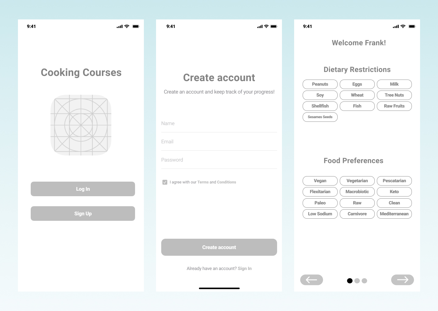
Mid-Fi
For our mid-fidelity prototype, we designed several layout options for the onboarding experience. Keeping Frank’s needs at the center, we focused on creating a seamless, personalized flow that captured his cooking tools, preferences, and goals. We then conducted usability testing to identify any points of confusion, friction, or structural issues within the wireframe, ensuring the onboarding felt intuitive and supportive from the start.
HI-FI
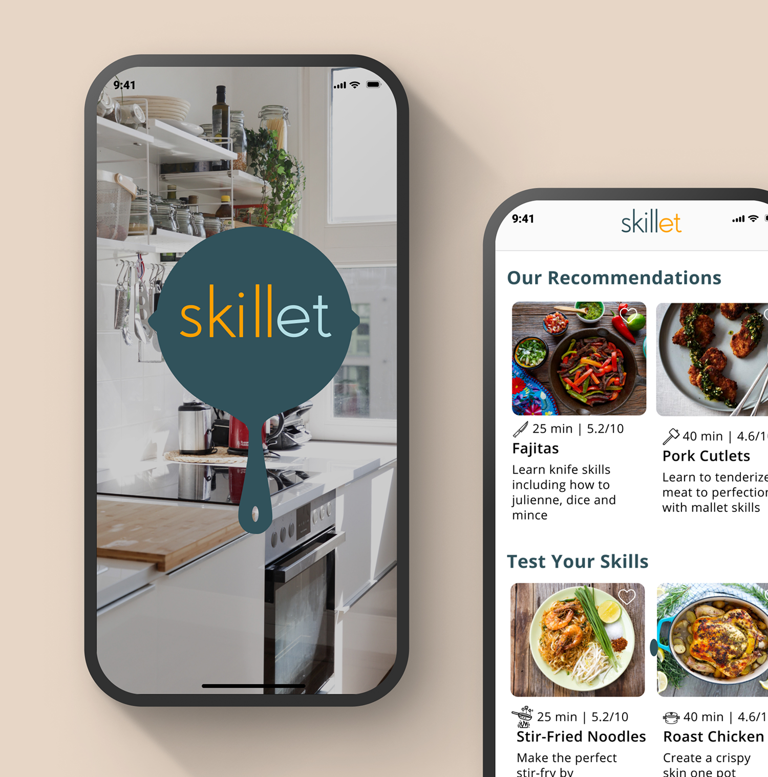
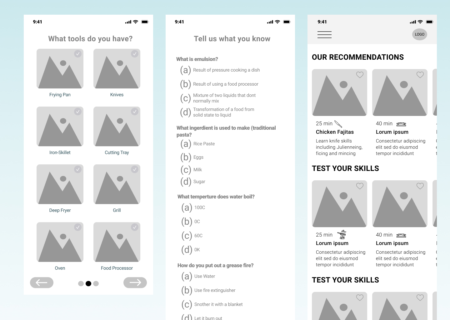
After completing our usability testing, we moved into the high-fidelity phase, incorporating all insights gathered from the mid-fidelity evaluations. Iterating as we designed allowed us to stay aligned with our timeline while ensuring we delivered an experience that felt refined, intuitive, and user-centered.
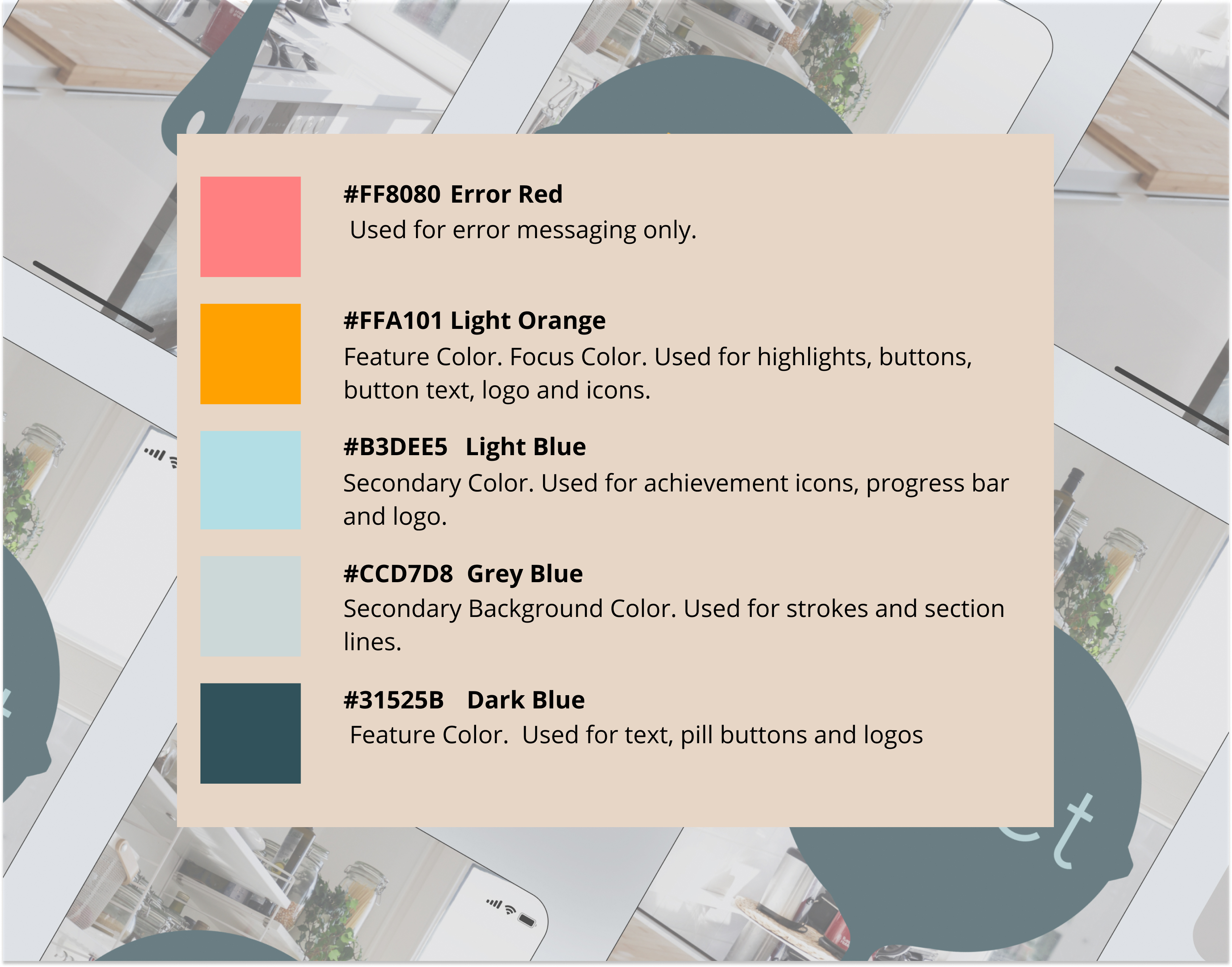
We started by selecting a color palette that communicated professionalism, educational value, and a connection to food. Our goal was to strike a balance of visuals needed to be clear and engaging without overwhelming Frank with unnecessary complexity or dense copy. The palette we chose is an analogous scheme supported by two complementary colors for contrast and hierarchy.
For typography, we selected Open Sans, a clean and highly legible font. This choice supports quick scanning. Critical for users like Frank who may be referencing the app while cooking and can’t take their eyes off the stove or cutting board for long.
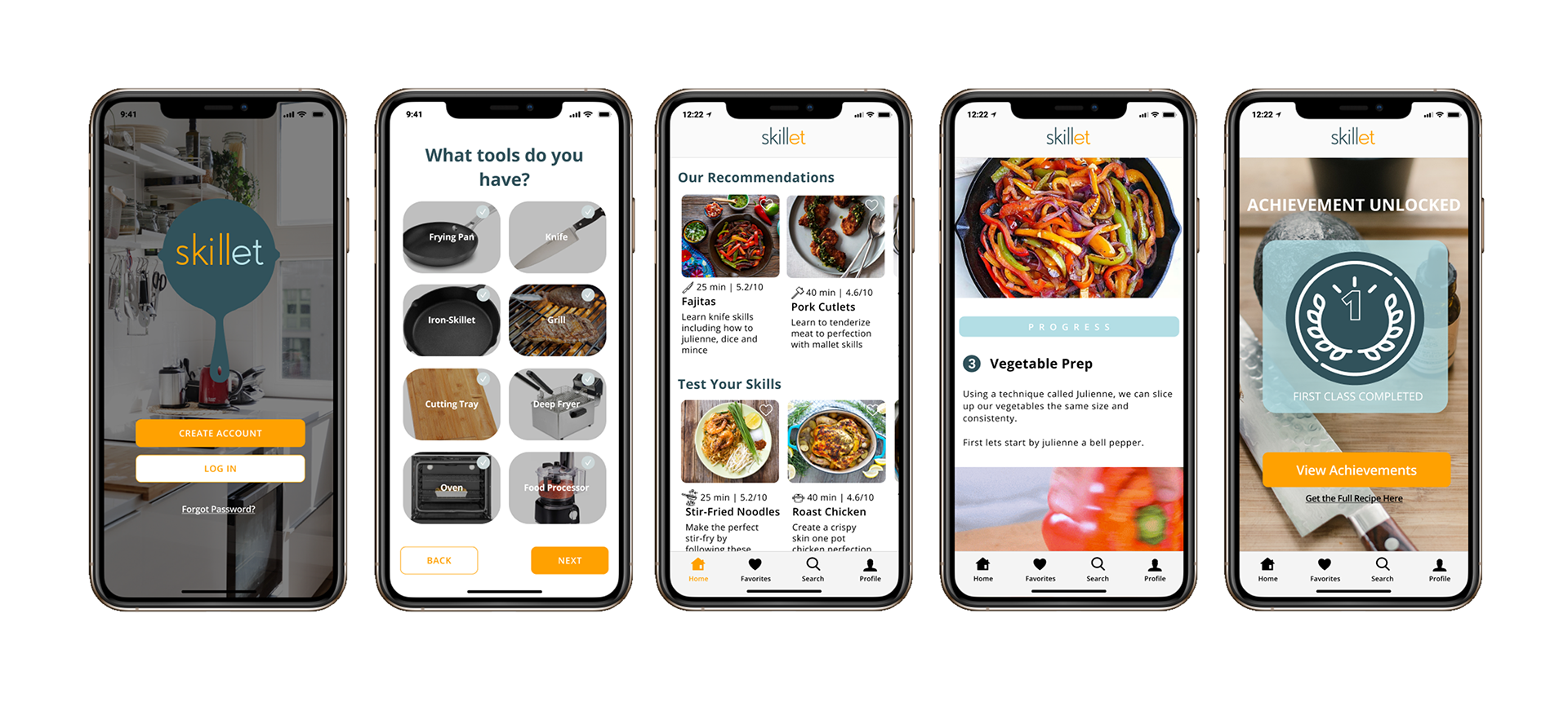
Together, these visual decisions helped create an interface that is approachable, instructional, and easy to navigate. Below are several examples of our high-fidelity designs for Skillet.
Hi-Fi Findings
Our high-fidelity usability testing uncovered insights that were both surprising and energizing for the team. One of the most impactful discoveries was how instinctively users gravitated toward the search function. Even when multiple pathways were available, users consistently chose search first because it felt like the fastest and most reliable way to find exactly what they wanted. This behavior validated our assumption that users, especially those juggling busy schedules like Frank, value efficiency above all else. It also emphasized how essential a robust, intuitive search experience would be to the success of the product.
Another highlight came from the response to the Achievements page. Many participants lit up when they reached it, describing it as “fun,” “motivating,” and even “a little addictive.” This moment was exciting for us because it confirmed that progress tracking wasn’t just a nice-to-have feature. It genuinely inspired users to keep learning, experimenting, and growing. Seeing users emotionally connect with something we designed reminded us why these small moments of delight matter so much in educational tools.
Together, these findings gave us a clear picture of where the product was succeeding and where it still needed refining.
Next Steps
With our insights in hand, we outlined key next steps to continue shaping Skillet into the most supportive learning companion possible:
- Build out and refine the search function
Users made it clear: search is central. Our next phase will focus on enhancing its speed, accuracy, and overall usability so users can effortlessly find courses that match their goals, skills, and tools. - Explore designs for additional breakpoints (iPad / tablet)
Many people cook with a tablet propped up on the counter, so we want to expand the experience to feel natural and fluid on larger screens—without losing the simplicity that makes Skillet approachable. - Make improvements guided by Hi-Fi usability recommendations
Every piece of feedback is an opportunity. We'll refine interaction patterns, polish microcopy, and fine-tune visual hierarchy to reduce friction and amplify the moments that users loved. - Share and test the updated prototype
As we iterate, we’ll continue validating with users to ensure the experience stays grounded in real needs, real behavior, and real emotion.
Final Reflections
Looking back on this project, what stands out the most is how much the product evolved once we truly listened to our users. What started as a concept focused on baking transformed into a cooking-centered learning tool, not because we changed direction on a whim, but because real people showed us what they needed. That shift was a powerful reminder that good design isn’t about defending our ideas. It’s about staying open, curious, and humble enough to let the research guide us.
Working with Frank, our persona, became a surprisingly grounding part of the process. Whenever we felt stuck or overwhelmed, coming back to his goals and frustrations helped us make decisions with clarity and purpose. He gave the project a human heartbeat, and in many ways, kept us honest in our design thinking.
Moving into mid- and high-fidelity design taught us the importance of iteration. Every round of sketches, wireframes, and prototypes strengthened the product, not because everything worked, but because so much didn’t. The usability tests, especially, reminded us that small details matter, the visibility of a button, the clarity of an instruction, even the emotional lift of an achievements page. Watching users interact with the product, hesitate, smile, get confused, or get excited was invaluable. Their reactions shaped the experience far more than any assumptions we could have made in isolation.
This project also reaffirmed the emotional side of design. Cooking is personal. It’s messy, stressful, joyful, and sometimes intimidating. Creating an experience that supports someone in that space required empathy, patience, and constant reframing. The moments when users lit up when they felt seen, supported, or inspired were the most rewarding parts of the entire journey.
Ultimately, this project taught me that meaningful design isn’t just about solving problems, it’s about empowering people. It’s about creating tools that help someone feel more confident, capable, and creative in their everyday life. And if our work can make someone like Frank feel just a little more excited to step into the kitchen. That’s the kind of impact that makes all the late nights, iterations, and sticky notes worth it.